In this blog post, we are going to go over the steps of building a clinical dashboard using Power BI to create our clinical business intelligence portfolio project.
Firstly, why should you create a clinical business intelligence portfolio (CBIP)?
As you might have experienced during your job search, many roles in the health informatics field are looking for those years of experience, even though some might be listed as “entry-level”. So you get into this frustrating chicken and egg situation where you need the experience to get the job, but the job requires experience. Although, getting a job can be equal parts timing and luck, just throwing your resume into the void of LinkedIn or Indeed can feel like you’re not even moving the needle.
Instead, you can consider creating a CBIP to help develop and showcase your technical skills, especially if you already have a strong clinical background as a nurse or pharmacy technician, showing that you also have the necessary technical skills, which can help strengthen your job application.
Once you have created your own CBIP you can link to it, in a professional blog, GitHub account or just hyperlinked within your resume. This gives you an opportunity to showcase the technical skills you have developed during the interview.
If you prefer to watch rather than read, check out the video below:
Table of Contents
Introduction to the Key Performance Indicators
Before we jump into building this project, some of the common key performance indicators that can be used by healthcare organizations and will be used in this project include:
- Average Time to See Healthcare Provider: Which can be the average elapsed time between when the patient was admitted and when they saw a healthcare provider.
- Patient Satisfaction: Can be a score provided by the patient, rating the care provided, with a score of 1 being very unsatisfied to 5 being very satisfied.
- Patient Re-admission Rate: Can be calculated as the number of patients re-admitted back to the hospital within a 30-day period divided by the total number of patients admitted within a 30-day period.
- Average Hospital Length of Stay: Which can be the average elapsed time between when the patient was admitted and when they were discharged.
Each hospital or healthcare organization can determine what are the target values for these KPIs, as this can vary widely based on the location and size of the organization to name a few factors. These metrics can represent a holistic view of how the organization is performing and by focusing on these metrics, one can help drive improved patient outcomes.
The dataset that we will be using for this portfolio project consists of fake dummy data, you can choose to follow along with the dataset I have provided here, or you can use other open-source datasets as well.
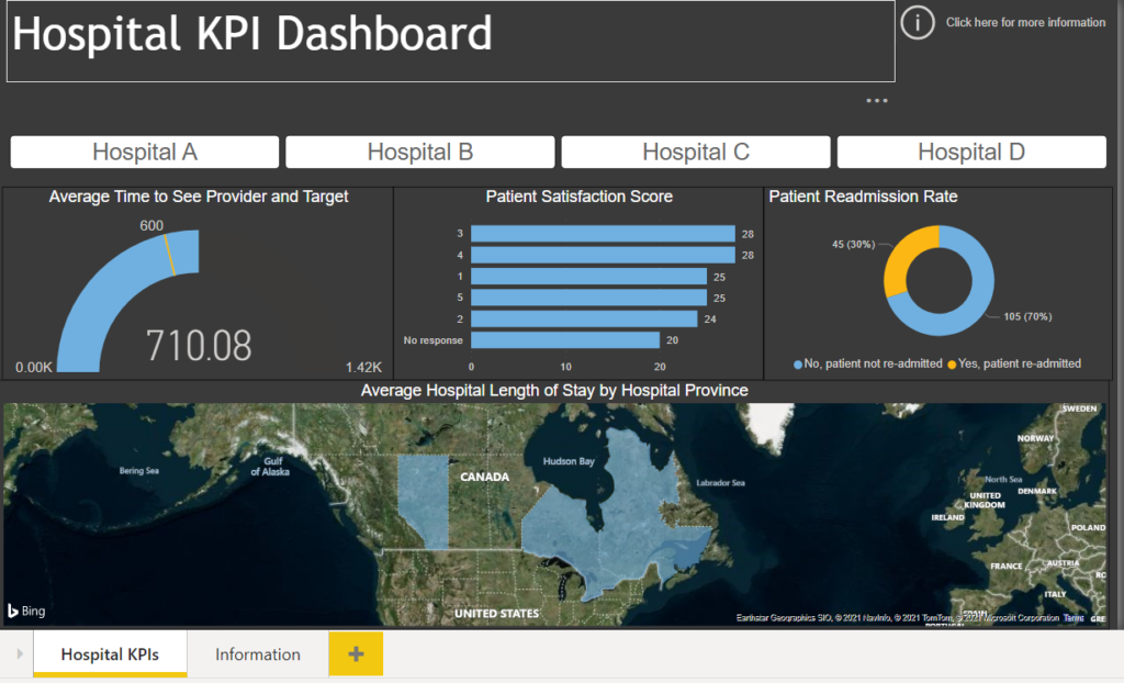
The final result of this project will be to create this Power BI report:
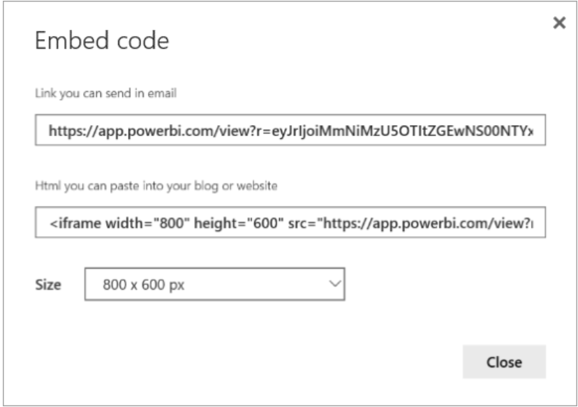
Once you have finished creating this report you can “publish to web“, and you will receive a unique link that can be embedded into a professional blog or just hyperlinked within your resume. This will give you an opportunity to speak to the technical skills you have developed and the specific data cleansing methods you have applied. When it comes to downloading the tool Power BI Desktop, you can do this for free here or through the Microsoft Store. Let’s get started!
Want to create this above dashboard and add both Power BI and SQL skills to your resume? Click the link to learn more about how YOU can become a Healthcare Data Analyst!
Cleaning the Dataset
When you open Power BI Desktop, one of the first things you will want to do is go to Get Data so we can load in our Excel workbook we downloaded, to wherever you have it saved in your directory.
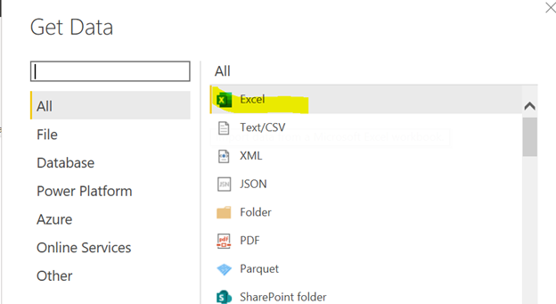
Instead of selecting “Load”, we want to select “Transform” as this will launch Power Query editor where we will do the majority of our data cleansing.
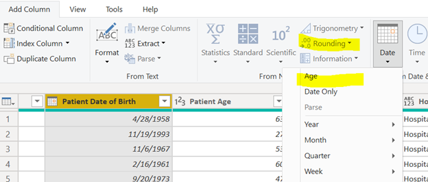
Since we have the Patient Date of Birth column in our dataset, Power Query has a built-in Age function in the ribbon that we can use since we know the Patient’s Date of Birth and Today’s date
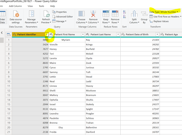
You also have to be mindful of the different data types Power BI automatically assigns to our dataset, as this will make a difference when it comes to applying certain aggregations to our data such as Count or Sum. For instance, I will change the Patient Identifier to a text data type rather than the current data type that was detected by Power BI
We also have to be aware of the trailing whitespaces in our dataset, which is quite common when data is entered in manually, which can occur when the data is entered in by the clinician or medical scribe into the EHR or other patient encounter record. We can fix the trailing whitespaces by selecting our column of interest, right-clicking, selecting “Transform” and then “Trim”.
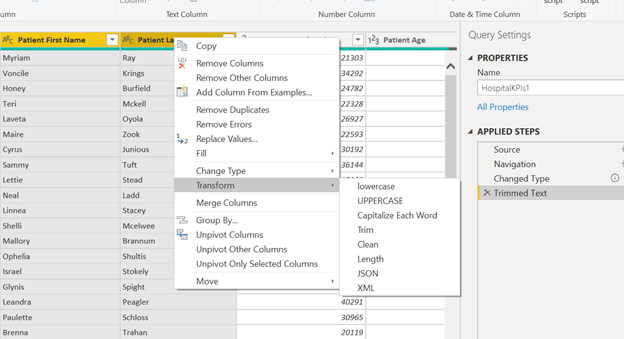
There are also many other great functions that you can use in Power Query editor to manipulate and clean your data such as pivoting and unpivoting columns, concatenating columns together (i.e., Merging the Patient’s First and Last name into one Patient Name column) and extracting the date and time from a column to get the total number of days or minutes.
Building the Dashboard
Now that we have cleaned the dataset, we are now ready to visualize our data. Creating your actual report in Power BI is not difficult, much of an analyst’s time is spent cleaning the data. Ensuring the dataset is of high quality and integrity, is the part that is often the most complex and time-intensive and might be an area where interviewers want to test your skills the most, so it is important that you can speak to the data cleansing portion of building a report or dashboard.
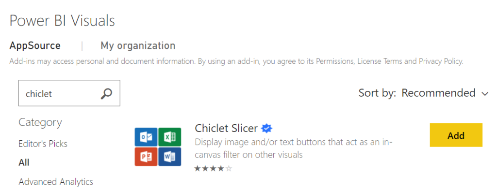
With choosing the visualizations, there are many built-in charts that are contained in the Power BI report section and there are even visuals you can add in. I often use the chiclet slicer visual, this is a Microsoft verified visual, and is a great filter to add to your report.
For a walkthrough of building the “Hospital KPI Dashboard” report, I first showed, click here and follow along!
Once you have built your report you can now “publish to web” where you will get a unique link
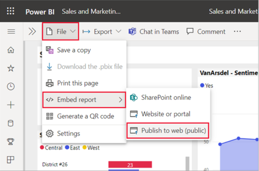
You can embed this link in your resume and speak to the process it took to create your own clinical business intelligence portfolio and what lessons you took from it. Comment down below, have you created your own Clinical or Healthcare Dashboard? What was the most difficult part?
0 Comments