At the beginning of 2026, the theme I wanted to weave throughout the Health Analytic Insights newsletters was a focus on quality improvement (QI).
I believe the field of QI and health informatics go hand in hand. There are some key tools and frameworks from the quality improvement field that are critical for health informatics professionals to know to advance and, more importantly, make a difference in improving patient outcomes.
Looping back to the QI case example I introduced at the beginning of the year.
As a Healthcare Analyst, imagine you are in a meeting one day, and the Communications team mentions that there have been several negative reviews from patients who don’t feel supported after their hip replacement surgeries. As part of the QI team, this project falls on your desk to figure out how to improve the patient experience at your hospital.
Throughout the previous newsletters, we discussed:
- Defining QI measures (outcome, process, and balancing measures) to understand what measures make the most sense to include in your project plan
- Frameworks to brainstorm outlining your QI project plan (i.e., DECIDE Framework, 5 Whys, Plan, Do, Study, Act cycle)
- The use of the Aim statement to clearly define to our project team what we are measuring and how to define success when implementing this project plan:
We want to implement the Oxford Hip Score assessment within our department and reach an overall 75% patient satisfaction score by August 2026.
Once we have had the necessary conversations with clinical and administrative partners and have involved them in all aspects of our project plan, we are able to implement our change into the clinical workflow. As the Plan, Do, Study, Act cycle outlines, we might want to implement our QI change with a pilot or on a small scale, prior to rolling it out across the department. To understand whether this implemented change is having the expected impact, I will wrap up this QI theme by discussing the importance of using run charts.
What are Run Charts and Why are They Important?
Run charts are graphs which visualize the change you have implemented over time and help to determine if the change had the intended impact.
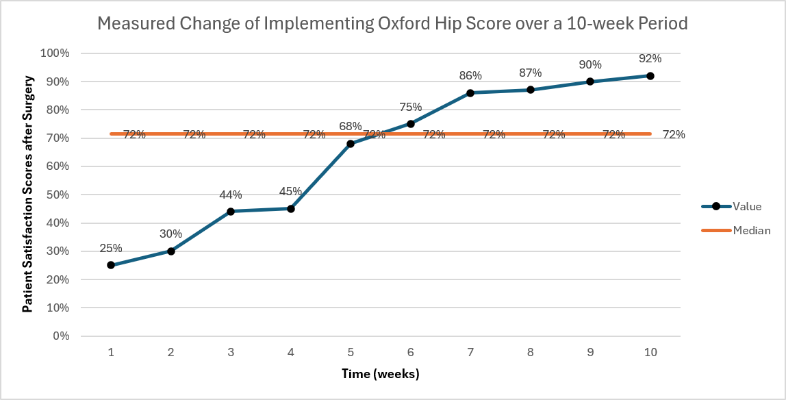
In the run chart I have created for this QI case example. On the y-axis, I have the patient satisfaction scores (target is 75%) collected from patients’ responses, for a survey measuring how supported patients felt after their surgery. On the x-axis, I have the time in weeks over a 10-week period.
Imagine we implemented the Oxford Hip Score assessment in the department at Week 0 and reached our target goal of a 75% patient satisfaction score after Week 6, by surveying patients in our department.
To understand the impact of this implementation on our patient population, we reviewed the patient satisfaction scores over a 10-week period from the time we implemented the Oxford Hip Score assessment (Week 0). From this graph, we do see a trend (5 or more consecutive data points going in the positive direction) over time. However, we will want to continue to monitor this implemented change to see if the patient satisfaction score stabilizes or decreases over time.
The main point as to why run charts are important is that they quantify continuous improvement. It’s not good enough to just implement a change and close out the project; it’s key that we consistently adapt and tweak our QI plan, as the healthcare system is complex and there are several moving parts.
For example, working in the health informatics field in Ontario, most QI projects I am aware of were impacted significantly by the pandemic, as priorities rapidly shifted; even to this day, the healthcare field is in the rebuilding phase. As well, everyone who works in healthcare knows that when an organization moves to adopting a new electronic medical record system, all your QI plans go out the window because the focus shifts to integration work.
The purpose of this newsletter series was to introduce you to the field of quality improvement and how it interconnects with the field of health informatics. I hope this was of value to you. If you have any questions, please drop a comment below or feel free to email me at healthanalyticinsights@gmail.com
If you want to walk through your own clinical project, similar to what I’ve done through this newsletter series, check out my course here, which can help you to advance your skills in Power BI and SQL. You can also document your work by completing this course and developing your own clinical dashboard that you can link to in your resume to stand out to hiring managers.
Discount for blog readers (10% off using code: FALLSURGE, valid until October 29th, 2026)
0 Comments